How To Choose Eye-Catching Color Combinations For Embroidery
You sketched out a design you want to stitch and now it’s time to figure out what colors you want to use. You pick a few that look nice, but once you’re almost done stitching you realize something doesn’t look right. The colors just don’t seem to go together like you thought they would, but you’ve already spent so much time on your project!!
If this has been you before and you struggle with choosing colors that go together and look great in your embroidery projects, you’re in the right place! This article will go over the basics of color theory, how to match embroidery colors, and some tips for choosing the best color combinations for embroidery that will really level up your artwork.

Disclaimer: This post contains affiliate links, which means I may earn a small commission if you choose to purchase an item.
Choosing Beautiful Color Combinations For Embroidery

Color Theory Basics
In order to pick color palettes that are balanced and beautiful, you need to be at least a little bit familiar with basic color theory.
The Color Wheel

First, let’s go over the color wheel. Color wheels are made up of pure colors that have no white, grey, or black added to them, also known as hues. The colors that are included in the wheel are:
- Primary Colors (red, blue, yellow)
- Secondary Colors (orange, green, violet)
- Tertiary Colors (green-yellow, yellow-orange, orange-red, red-violet/purple, purple/violet-blue and blue-green)
It’s good to keep the color wheel in mind because you can use it while you’re planning out and picking colors.
Tints, Shades, and Tones
We’ve touched on pure colors, but there are also colors that aren’t pure. These are colors that have white, black, or grey added to them.
- Tint – A hue with white added to it
- Shade – A hue with black added to it
- Tone – A hue with grey added to it
Using different tints, shades, or tones of the same base hue will help add depth and dimension to a piece of art.
Color Schemes
These are some basic colors schemes that work well together. I have linked additional articles that go in depth about each one if you’d like to learn even more.

Monochromatic
Monochromatic colors are colors that are all the same base hue, but they can be a combination of different tints, shades, and tones of that singular hue. This color scheme is feels modern and peaceful.

Complementary Colors
Complementary colors are colors that are on the exact opposite of one another on the color wheel. The most basic combinations of these are:
- Red and Green
- Blue and Orange
- Yellow and Purple
These are not the only combinations, as you can also use tertiary colors that are opposite to one another on the wheel. The only thing that matters is that they are opposite to one another!
Using complimentary colors balance one another out and can make the colors really stand out and appear brighter.

Split Complementary
This color scheme uses three colors. Two colors that are adjacent to the third color’s compliment.
The easiest way to choose these colors is by starting out with one base color and then finding it’s complimentary (opposite on the wheel) color. The colors directly beside the complimentary color are the second and third color you’d choose.
Some examples:
- Purple, Yellow-Orange, Yellow-Green
- Red, Purple, Yellow-Green

Analogous
Analogous colors are three colors that are directly beside one another on the color wheel. For example, a primary and secondary color, and a third color that is a mix of the two.
Some examples:
- Blue, Blue-Green, and Green
- Red, Red-Yellow, and Yellow

Triadic
A triadic scheme is made up of three colors that are evenly spaced out on the color wheel. They can have a combination of primary, secondary, and tertiary base hues.
- Red, Blue Yellow
- Green, Violet, Orange
- Yellow-Orange, Blue-Green, Red-Violet
Now that you know a little bit about color theory, you should now understand a little bit more around why certain color combinations look really good together.

Tips For Developing Color Palettes
Using Color Psychology
Another way to develop color palettes is to think about the mood or emotions you want your embroidery to evoke.
- Saturated colors are very loud, bold, and exciting.
- Muted colors have a more peaceful effect on the viewer’s eye.
- Using lighter colors can create a more lighthearted piece of art while a darker color palette can be used for more mysterious or melancholy subject matter.
Particular hues of colors can also portray different ideas and emotions. For example, yellow is a cheerful color, blue can be seen as a trustworthy color, and green a relaxing color.
When it comes to color psychology, there’s a lot more you can learn. Check out this article to read more about it.
Helpful Tools
While you can certainly create color schemes from scratch, there are plenty of helpful tools out there to help you pick out color palettes for embroidery.
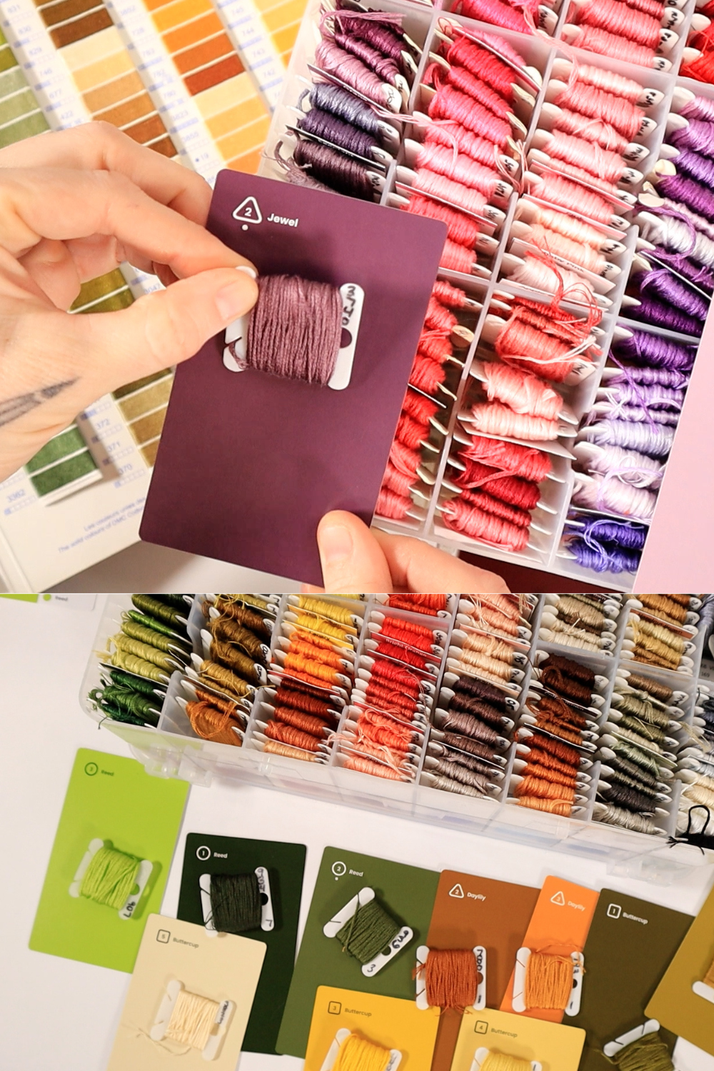
Zollie has a really fun and helpful card pack called Palette Scout that helps you easily develop a cohesive color scheme. You don’t need to be a pro at color theory to use them. In fact, they’ll help you learn more about color as you use them!
Here are a few places that have color palettes to choose from that I find really helpful:
- Canva.com – has a page full of beautiful color palettes
- Coolors.co – another website that is a color generator tool. You can upload a photo to pull colors from it or use their random generator.
- Stitchpalettes.com – another phenomenal website that provides color palettes specifically for embroidery.

This book by Trish Burr has so much valuable information as well as color palettes for embroidery, geared mostly towards thread painting but would be overall super helpful for any style of embroidery!
Purchase on Amazon

Stranded Thread card with all of the DMC colors. Makes it super easy to color match!
Purchase on Amazon
How To Match Embroidery Colors
If you’re using a color palette generator, it will be easy to choose a color palette to work with. However, matching the colors to embroidery thread can sometimes be a challenge.
Color Matching From a Photo
If you’re working off of a reference photo and you need to match a color in it, the easiest thing to do is to upload the photo and use a color dropper tool in tablet or iPad apps such as Procreate. You can also upload a photo in coolors.co to pull out some of the colors.
Use a Thread Color Chart For Embroidery
The easiest way I find to match colors is to have a thread color chart to reference. DMC makes a color chart that is printed or made with real thread. The chart with real thread is a bit more accurate than the printed version to match with.
Embroidery Color Combinations
Color Schemes
Here are a few color schemes with corresponding DMC colors to get you started.

Once you’ve chosen the colors you want to work with, it’s helpful to create a color mockup. This way you can plan what colors you want to use where and make sure that you like the way the colors look altogether.
Additional Learning
- Karen Barbe’s book Color Confident Stitching is another amazing resource to learn more about developing color palettes.
- A Skillshare class that I have taken and loved is Charly Clement’s Fun With Color class. (It’s helpful to have some sort of drawing software such as Procreate for this one.)
- Please check out my Patreon for even more embroidery tutorials – there’s lots of helpful information about picking a color palette, color theory, color matching, and more.


![How To Embroider A Sheep [Simple Tutorial]](https://crewelghoul.com/wp-content/uploads/2023/01/how-to-embroider-a-sheep-1-scaled.jpg)


